


Ligue 1 has long had a reputation for playing it safe with its shirts. The 2026/2027 season definitively puts that idea to rest. Between Monaco’s diagonal, Paris’s Hechter stripe, Nantes’ green gradient, and several highly detailed third kits, French football is delivering one of its most cohesive collections in recent years.
Ligue 1’s strength lies in its long-standing visual identities: blood and gold, yellow and green, a red-and-white diagonal, a vertical stripe. When manufacturers respect these codes, the result is instantly recognizable. Here’s our ranking of the ten best shirts of the season, and what makes each one work.
At the top of the ranking are three shirts built around historic visual codes: Monaco’s diagonal, Paris Saint-Germain’s central stripe, and RC Lens’s yellow shirt with red shoulders. Three simple designs, impossible to mistake for another club’s.
Further down the list, the season rewards shirts that dare to use texture: Nantes’ green gradient, Metz’s geometric third-kit pattern, and Lille’s red embroidery on its third kit. All the featured designs are available in the store’s Ligue 1 collection.
The ten best shirts
Like any shirt ranking, this one reflects a point of view. It values clear design, respect for the club’s identity, and quality execution: a well-placed pattern, a collar that fits, and a sponsor that doesn’t take over the chest.

The diagonal, unchanged
Red on top, white on the bottom, separated by a crisp diagonal across the chest: Monaco has one of the most recognizable designs in European football, and this version leaves it untouched. The red polo collar neatly finishes the look, and the white sponsor stands out effortlessly against the upper section. A demonstration of what simplicity can achieve.
View the jersey
The Hechter stripe at its boldest
Royal blue, a central red stripe edged with two white pinstripes, and red sleeve trim: the Paris shirt returns to its most recognizable design. The two stars sit above the crest, and the crew neck leaves the chest unobstructed. It’s a design that’s fifty years old and still works just as well.
View the jersey
Blood and gold, without compromise
Yellow dominates, the shoulders turn red, and the manufacturer’s stripes follow suit. The polo collar edged in red and navy avoids the training-shirt look, and the red sponsor fits naturally into the palette. A warm-looking shirt that captures the atmosphere of its stadium perfectly.
View the jersey
White, pared back to the essentials
Crisp white, a navy crew neck edged with gold piping, the same colors repeated at the cuffs, and nothing else. The crest stays centered, while the navy sponsor logo keeps the chest uncluttered. It’s the most pared-back Olympique jersey in a long time, and probably the most elegant.
View the jersey
Yellow and green through a prism
The body stays yellow, while the shoulders and sleeves shift into a green gradient made up of triangles, from lightest to darkest. The effect recalls a stadium mosaic and adds depth to a kit that could easily look flat. One of the most original ideas of the French season.
View the jersey
Black that looks better up close
Against an anthracite-black background, a repeating geometric pattern covers the entire jersey and only reveals itself up close. The red and yellow trim on the collar and sleeves, the yellow Cross of Lorraine, and the kit maker’s shoulder stripes give the look structure. A dark kit that’s anything but gloomy.
View the jersey
Cross-stitch embroidery
Deep blue, a navy polo collar, and, above all, fine red embroidery running along the sides and around the collar, in a textile style rarely seen on a football jersey. The sponsor’s white logo stands out clearly at the center. An artisanal design, far removed from the usual digital gradients.
View the jersey
White, navy, and touches of gold
The white body is framed by navy shoulders and red bands, with a fine vertical blue and red stripe down the center. The gold collar and cuffs give it a dressier touch than most shirts in the league. A balanced jersey that confidently brings together the club’s three colors without going overboard.
View the jersey
A wide band across the chest
The club’s royal blue is crossed by a horizontal navy band that spans the entire chest and displays the sponsors. The navy crew neck and white sleeve trim neatly finish the look, while the club’s 120th-anniversary detail appears at the back of the collar. Simple, structured, effective.
View the jersey
Waves on a navy background
Paris FC’s navy blue is enlivened by light blue wavy patterns that flow over the shoulders and sleeves, like a current. The rest of the jersey is kept clean, avoiding a cluttered look and highlighting the crest. A visual identity still taking shape, with a very promising start.
View the jerseyTwo special mentions
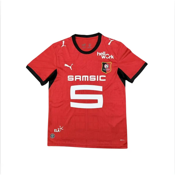
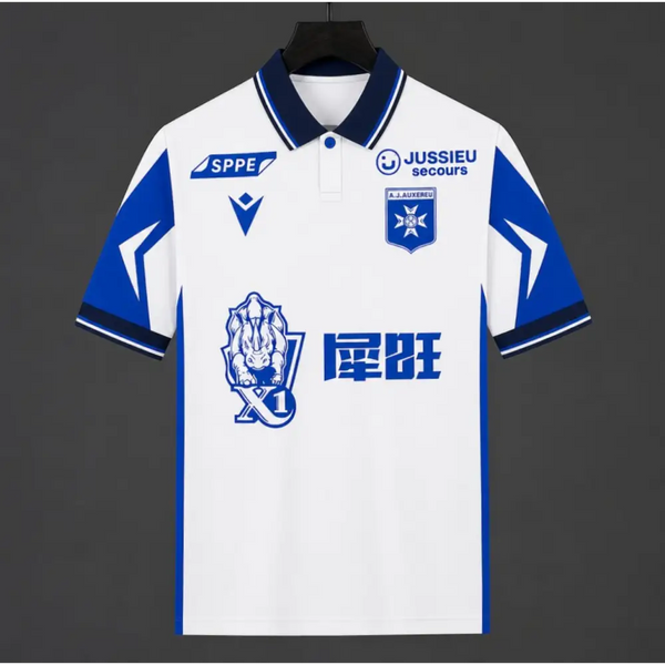
Two jerseys deserved a spot and narrowly missed the ranking. The first for its texture, the second for its bold contrast between tradition and modernity.
What the French season tells us
Looking at the twenty teams’ changing rooms, one thing stands out: Ligue 1 favors its historical codes over fleeting trends. The jerseys that work best are those that revive an old design, sometimes fifty years old, refining it rather than reinventing it.
Another thing to note: French third kits have more than caught up with England. Metz and Lille have two of the league’s most detailed jerseys this season, even though they’re their third kits. If you’re still unsure about the differences between a club’s kits, our article on choosing between home or away will help.
Which one to choose for your needs
A Ligue 1 jersey is rarely chosen by chance: there’s the club you support, and there’s the jersey you want to wear. The two don’t always align, and that’s okay.
- For the stadium: The home jersey is always a safe choice. Lens, Marseille, and Paris are the most worn in the stands this season.
- For everyday wear: Dark kits go with everything. Metz’s and Lille’s third kits are easy to wear outside of a football setting.
- For a gift: Choose a timeless design. Monaco’s diagonal or Marseille’s white jersey will age better than a very dated pattern.
Finally, if you’re looking for a piece that’s unlike any other, take a look at the jerseys from past decades: we’ve brought together the iconic jerseys of the 2000s in a separate ranking, featuring several French clubs.
Frequently asked questions
In our ranking, AS Monaco’s home kit comes out on top thanks to its red-and-white diagonal, the most recognizable design in the league. Paris Saint-Germain’s and RC Lens’s home jerseys round out the top three.
It’s the so-called Hechter stripe, created in the 1970s and now the club’s signature. It regularly returns on home kits, sometimes wider, sometimes narrower, but always centered.
They are generally produced in more limited quantities than home jerseys. Popular sizes sell out faster, and some styles are not restocked at the end of the season.
The fan version has a comfortable fit, while the player version is more fitted. The best way to choose is to compare the flat chest width in the size chart with that of a jersey you already own.
A Ligue 1 that embraces its heritage
The 2026/2027 season confirms good news for French football: its jerseys can now hold their own against those of the major neighboring leagues. Historic clubs are staying true to their signature styles, others are patiently building a visual identity, and third kits are finally becoming a playground for creativity.
To compare the available cuts, colors, and sizes, see all the styles in the store’s Ligue 1 collection, with details on each product page.