


The Premier League remains the league where kit makers take the biggest risks. Big budgets, global exposure, century-old clubs: every season, the twenty English dressing rooms produce an impressive range of designs, from the safest return to tradition to patterns that instantly divide the stands.
The 2026/2027 collection is no exception. It features redesigned stripes, a historic diagonal brought up to date, a tribute to the 1980s, and several third jerseys that are much bolder than the home kits. Here’s our ranking, based on simple criteria: how easy the design is to make out, how well it fits the club’s identity, and how enjoyable it really is to wear.
The top spots go to clubs that have managed to modernize their heritage without betraying it: Newcastle’s irregular stripes, Crystal Palace’s red and blue diagonal, and Manchester United’s anniversary jersey, directly inspired by 1980s cuts.
Third kits are the season’s big surprise, with highly graphic designs at Manchester City, Everton, and Tottenham. All the featured designs are available in the store’s Premier League selection.
The ten best-looking jerseys
This ranking is subjective, like all jersey rankings. It favors kits that remain easy to make out from a distance, say something about the club, and hold their own against the best seasons of the past. Every featured design is available to buy in the store.

Stripes that can finally breathe
The black and white stripes are no longer all the same width. The alternation of thin and thick bands adds depth that the regular version had been missing for a long time, while the royal blue crew neck, repeated on the shoulders, brings the missing touch of color. An instantly recognizable jersey, even in a tiny image.
View the shirt
The diagonal, time and time again
Against a white background, the red and blue diagonal stripe crosses the chest with remarkable precision. Both colors are broken down into fine parallel lines, creating movement without overwhelming the overall design. The collar and shoulders repeat the pattern in miniature. This is the kind of jersey you can recognize from thirty meters away, even without seeing the crest.
View the shirt
A journey back to the 1980s
A white polo collar edged in red, three stripes on the shoulders, a vintage trefoil logo, and the city coat of arms in place of the usual crest: every detail of this anniversary jersey harks back to the cuts of forty years ago. The red is bold, the fit is straighter, and the whole look evokes the late 1980s without slipping into pastiche.
View the shirt
A column of blue against a white background
The concept comes down to one idea: a wide central vertical stripe made up of a gradient of blues, from sky blue to navy, set against an all-white jersey. Everything else is left blank, drawing attention to the stripe and giving the crest room to breathe. It’s the most graphic jersey in the selection, and probably the one that will age best.
View the shirt
Red, with texture
Rather than a solid red, the jersey is covered in a scattering of small, pale chevrons that create a texture visible up close and blend into a vibrant red from a distance. The white collar and shoulder stripes provide contrast, while the centered white sponsor logo keeps the chest clear. A successful balance between pattern and restraint.
View the shirt
Forest green and bright yellow
A deep, almost dark green, accented with yellow trim on the collar, sleeves, and logo. The contrast is striking without being garish, and the combination recalls the away kits of English clubs in the 1990s. This is the easiest jersey in the selection to wear away from the stadium.
View the shirt
Purple, taken seriously
Fine, darker vertical stripes bring texture to a rich purple, with a tone-on-tone polo collar giving structure to the top of the jersey. The white sponsor logo stands out clearly, and the result is much more elegant than a solid block of color. A risky proposition on paper, but a real success on the hanger.
View the shirt
Royal blue and white panels
Chelsea blue is paired here with two white panels edged in yellow, placed under the arms and along the sides. The effect elongates the silhouette and recalls jerseys from the late 2000s. The light blue collar and gold details on the crest complete a look that is understated yet carefully designed.
View the shirt
The formula that never changes
Red body, white sleeves, V-neck trimmed in burgundy: Arsenal is sticking with the formula that has worked for decades. The dark inserts near the shoulders provide the only notable variation, and that’s enough to set this season apart from previous ones. An unsurprising shirt, and that’s exactly what supporters expect.
View the shirt
Gradient burgundy, sky-blue sleeves
The contrast between the burgundy body and sky-blue sleeves is the club’s signature. This version adds a graphic gradient pattern on the sides, bringing depth without making the design harder to read. The navy collar with its subtle pattern completes a modern, highly distinctive shirt.
View the shirtTwo special mentions
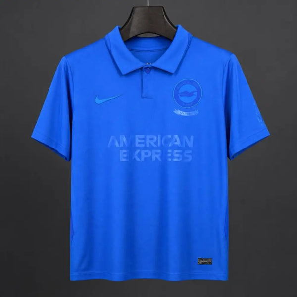
Outside the rankings, two designs are worth a closer look for opposite reasons: one for daring to go fully monochrome, the other because it isn’t really a match shirt.

The three trends of the English season
Looking at the full range of 2026/2027 kits, three clear trends emerge. They explain why some shirts look alike across clubs, and why third kits have become kit manufacturers’ favorite testing ground.
This latest trend deserves an explanation. The home shirt has to appeal to everyone and sell for two seasons, so it changes very little. The third kit, on the other hand, targets a wider audience than just season-ticket holders, which allows for bolder choices. We explain this approach in our guide to the role of each club shirt.
Which one should you choose for your needs?
An aesthetic ranking doesn't tell the whole story. The right choice depends on whether the jersey is for wearing at the stadium, around town, or as a gift for someone else. Three simple pointers are all you need to decide.
- For the stadium: go for the home jersey, the one most of the crowd will be wearing. Newcastle, Liverpool, and Arsenal are the safest bets in this selection.
- For everyday wear: third kits are easier to wear day to day because they steer clear of overly distinctive colors. Everton, Manchester City, and Tottenham look great with dark jeans.
- As a gift: anniversary editions make the biggest impression, as long as you know the recipient's size. Manchester United's 125th anniversary design is a perfect example.
If you're still undecided, simply look at what's selling best: our article on the best-selling jerseys gives you a good idea of which designs are popular season after season.
Frequently asked questions
In our ranking, Newcastle United's home jersey comes out on top thanks to its irregular-width stripes and royal blue collar. The choice is subjective, and Crystal Palace's diagonal design comes very close.
Because they don't have to stick to the club's historic colors. Kit manufacturers use them to test ideas they wouldn't dare try on a home jersey sold to a much wider audience.
These are generally shorter runs than regular kits, tied to a specific date. The most popular sizes sell out faster than they do for a home jersey that stays available all season.
The fan version has a comfortable fit, while the player version is much more fitted. Compare the flat chest measurement listed in the size guide with that of a jersey you already own.
A highly graphic English season
What stands out about this 2026/2027 collection is the balance between heritage and modernity. The oldest clubs are bringing back their historic signatures, while others are opting for highly graphic designs, and almost none go overboard.
If you want to compare the options at your leisure before choosing, all the models mentioned are gathered in the shop's Premier League selection, with available sizes listed on each product page.