


A club crest seems untouchable. It’s embroidered on chests, tattooed on arms, painted on neighborhood walls. Yet most major European clubs have changed theirs at least once, and some have done so so radically that supporters still remember it years later.
Behind these decisions, you always find the same drivers: readability on a phone screen, legal protection for a brand, the arrival of a new owner, or the desire to appeal to an audience that doesn’t live in the club’s city. Here’s why crests change, which clubs paid dearly for it, and what it means for those who collect jerseys.
A club changes its crest for five main reasons: to simplify its identity for screens, protect its brand legally, mark a change of ownership, correct a poorly received logo, or comply with an external rule.
The most famous cases are Juventus in 2017 with its simple J, Inter Milan in 2021, Arsenal in 2002 for trademark registration reasons, and Leeds United in 2018, whose new crest was withdrawn within twenty-four hours.
What a crest needs to do today
Historically, a crest identified a team on the pitch and connected the club to its city: a municipal coat of arms, a local animal, a founding date, sometimes a tool representing the neighborhood’s industry. It was designed to be embroidered, not seen at twenty pixels wide.
The context has changed. Today, the same symbol has to work on a jersey, but also as an app icon, in a news feed, on a video thumbnail, on merchandise, and in stadium signage. Fine details, small text, and gradients disappear in these formats. Hence the constant temptation to simplify.
A crest therefore serves three functions at once: it gives supporters a sense of belonging, serves as a registered trademark, and has commercial value across all kinds of media. When these three roles come into conflict, the club starts talking about a redesign.
The five reasons for changing a crest
Fewer lines, fewer colors, a symbol that remains legible at very small sizes. This has been the dominant motivation for about a decade, and the most debated.
A crest that looks too much like public coats of arms or is too generic is difficult to protect. Redrawing the symbol makes it possible to register it as a trademark and fight unauthorized use.
A new owner arrives with a plan, sometimes targeting a new market. L’s crest then becomes the most visible way to signal this change of direction.
A poorly received design can be withdrawn very quickly. British clubs are the ones that have most often reversed course under pressure from their season-ticket holders.
Competition regulations, an administrative merger, or the requirement to distinguish the club logo from a sponsor’s: some changes don’t come from the club itself.
Juventus 2017, a textbook case
In 2017, Juventus replaced its black-and-white oval crest, featuring the Turin bull and the crown, with a simple stylized J. The club’s argument was not about sport but about branding: it wanted to become a recognized entity beyond football, in fashion and entertainment, with a symbol that could be used as a monogram.
The reaction was immediate and largely hostile. Many supporters saw it as the disappearance of a visual heritage in favor of a corporate logo. In retrospect, however, the J has become instantly recognizable, which was precisely the goal. That is the paradox of these redesigns: their initial unpopularity says almost nothing about their long-term effectiveness.
Four years later, Inter Milan followed a similar approach, adopting a very pared-down IM monogram stripped of the old circle’s details. Here too, the argument was digital legibility and use beyond the pitch.
2017 : shift from a figurative crest to a monogram.
A black-and-white oval, the Turin bull, the crown and the club name. A dense image, designed for embroidery.
A J formed from two strokes and a bar. No figurative reference, making it suitable for use on any medium.
2016 : a deliberate return to an earlier design, following consultation with supporters.
A shield-shaped crest with an eagle, adopted in the late 1990s and never fully accepted.
A circular badge inspired by the club’s historic versions, featuring the ship and the rose, closer to the local identity.
2012 then 2015: the most controversial change of the decade in Great Britain.
L’s bluebird, the club’s historic emblem, associated with the color blue for decades.
A red dragon brought to the fore and a red home kit, before a return to blue three seasons later.
When supporters make the club back down
The most spectacular case remains Leeds United in 2018. The club unveiled a new crest built around a supporter’s gesture, a fist over the heart. Within hours, a petition had gathered more than seventy thousand signatures, and the project was abandoned the very next day. Rarely has a visual identity had such a short lifespan.
Everton had a similar mishap a few years earlier: a simplified crest, an outcry, a season-ticket holder consultation, then a revised version retaining the historical elements supporters had called for. Manchester City took a similar approach in 2016, holding a consultation before returning to a circular badge close to its earlier versions.
More recently, Atlético de Madrid also reversed course. After adopting a simplified version in 2017, the club put the question to a vote among its socios, who chose to restore the previous crest. The lesson is always the same: a crest belongs to the club on paper, but supporters see themselves as its guardians.
When a club announces a redesign “after consulting supporters,” it often means a return to an earlier version. When it talks about “modernizing the brand,” it almost always means simplifying it. The words in the announcement signal the outcome.
Changes that don’t come from the club
Arsenal changed its crest in 2002 for an unusual reason: the old design, too similar to a generic emblem, offered little legal protection. The new cannon, stylized and facing the other way, could be registered as a trademark and defended against unauthorized use. A change in appearance driven by the law, not aesthetics.
Other constraints come from competitions. A club whose visual identity is too similar to a sponsor’s may be required to adapt its logo to compete in a European competition, to comply with advertising rules. Finally, some mergers or name changes require starting from scratch, especially when the historic name is linked to a company.
In all these cases, the crest changes for reasons that are invisible from the stands. This is also what makes discussions difficult: the club cannot always publicly explain the legal detail that prompted the redesign.
For a collector, the crest dates the shirt
This is the most concrete aspect for anyone buying shirts. L’the crest is the best way to place a piece in time. A Juventus shirt with the old oval crest cannot belong to a season after the redesign. A Manchester City shirt with the eagle must date from between the late 1990s and 2016.
The same applies to secondary details: the number of stars above the logo, an anniversary mention, or a champion’s crest. All these elements must match the stated season. If you want to decode these markings one by one, our guide to what each badge on a shirt tells you explains what they mean.
Three shirts, each featuring a crest from a different era.
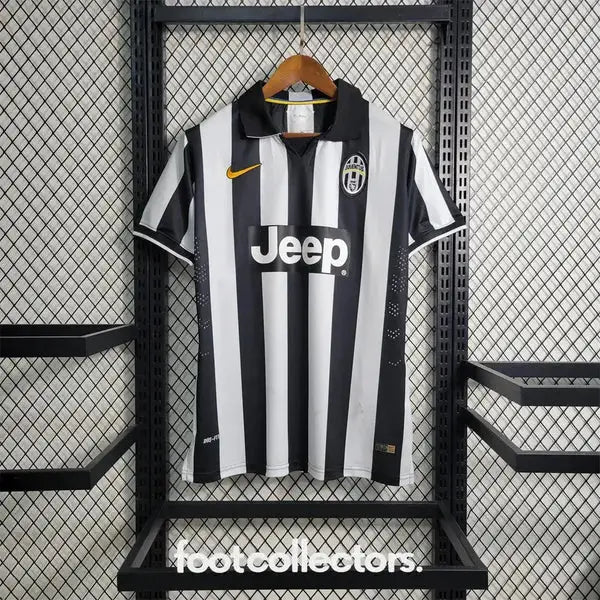
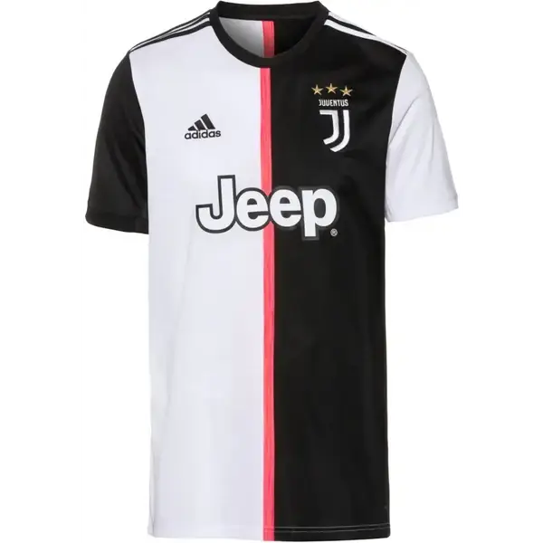
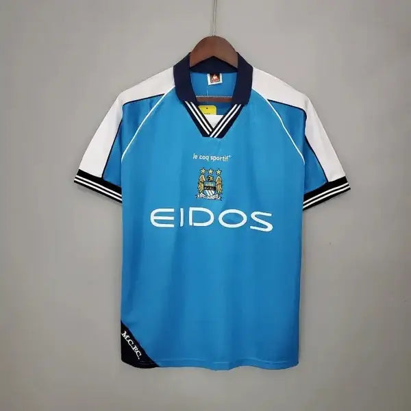
This is also one of the reasons for the success of vintage reissues: they let you wear a visual identity the club no longer uses. We explore this phenomenon in our article on the comeback of retro shirts.
Frequently asked questions
To turn its identity into a monogram that could be used beyond football, across all digital platforms and in other sectors. The club embraced a brand-driven approach rather than a heraldic one.
Yes, and it happens regularly. Manchester City returned to a historic circular badge in 2016, and Atlético de Madrid reinstated its previous crest after a vote by its members.
More and more often, especially in England and Spain. Clubs have learned from rejected redesigns, and several recent proposals were put to season ticket holders before their official launch.
Compare the crest, the number of stars, and any competition badges with the announced season. These elements should all match, as they rarely change at the same time.
Not necessarily, but it can happen. Cardiff City’s switch to red in 2012, before returning to blue in 2015, shows that an identity redesign can even affect the home shirt color.
A symbol that belongs to everyone
Changing a crest is never just a graphic detail. It’s a decision that affects a sense of belonging, and clubs that forget this find out very quickly. Successful redesigns almost always preserve a recognizable element: an animal, a color, a shape, a date.
For the supporter, these changes have one unexpected benefit. Each crest becomes a marker of its era, and an old shirt immediately tells you when it was worn. Yesterday’s controversial redesigns have become today’s dating landmarks.